DatePicker
There are 2 types: default, calendar.
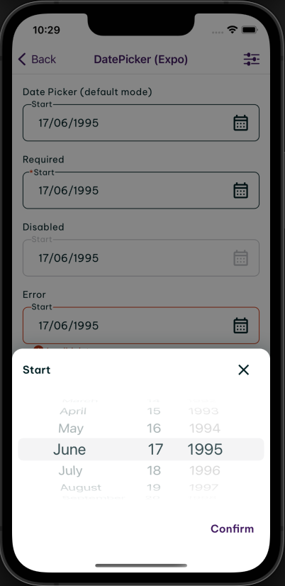
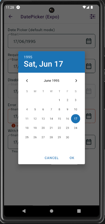
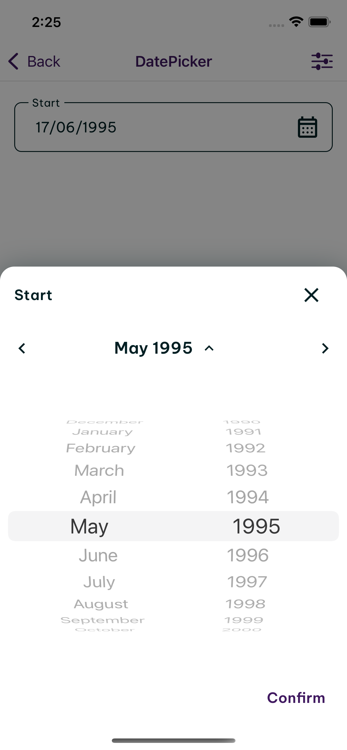
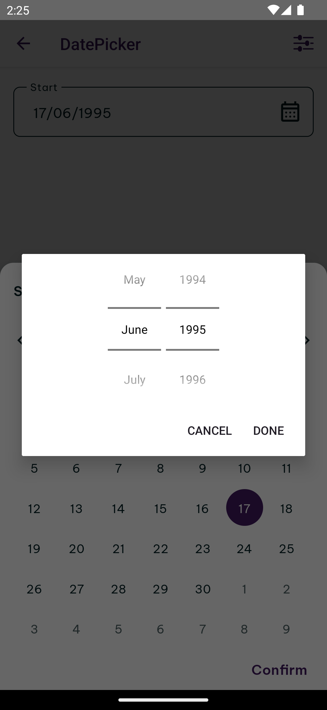
Default
The DatePicker consists of date, month and year, and same as the time picker, it allows users to control value selection by scrolling up or down on the corresponding wheel.
Preview
- iOS
- Android
Example
To use this component in landscape mode on iOS, you must first pass the supportedOrientations prop as specified in the React Native doc.
Calendar
The day of the week (DOW) picker allows users to select a day of the week from a calendar view. DOW pickers typically displays the days of the week as abbreviated text labels above, and offer navigation options for moving between different time period. Use this variant sparingly, as it currently doesn’t support quick navigation between months and years.
Basic
Month picker
In order to use this function, make sure you have @hero-design/react-native-month-year-picker installed.
- iOS
- Android
DatePicker Calendar also supports Calendar's month picker by default for faster navigation.
Localization
DatePicker will prioritize the displayFormat prop, then the locale prop. If none of them is provided, it will use the default locale from the HeroDesignProvider.
Custom render selected value
DatePicker also supports custom render selected value by providing a render function to the renderSelectedValue prop. This function provides the current date object and the formatted date string for the current display format. The format priority is displayFormat prop, then the locale prop. If none of them is provided, it will use the default locale from the HeroDesignProvider.
DatePicker Dialog
A standalone DatePicker without the text input component.
Props
DatePicker
Prop | Required | Default | Type | |
|---|---|---|---|---|
confirmLabel | required | string | ||
label | required | string | ||
onChange | required | (value: Date) => void | ||
autoTheme | boolean | |||
disabled | boolean | |||
displayFormat | string | |||
error | string | |||
helpText | string | |||
locale | string | |||
maxDate | Date | |||
minDate | Date | |||
monthPickerCancelLabel | string | |||
monthPickerConfirmLabel | string | |||
placeholder | string | |||
renderSelectedValue | (value: { date: Date; formattedDateString: string; }, props?: TextInputProps) => ReactNode | |||
required | boolean | |||
style | StyleProp<ViewStyle> | |||
supportedOrientations | ("portrait" | "landscape")[] | |||
testID | string | |||
value | Date | |||
variant | "default" | "calendar" | "month-year" |
DatePickerCalendar
Prop | Required | Default | Type | |
|---|---|---|---|---|
confirmLabel | required | string | ||
label | required | string | ||
onChange | required | (value: Date) => void | ||
TextInputComponent | ComponentType<TextInputProps> | |||
autoTheme | boolean | |||
disabled | false | boolean | ||
displayFormat | string | |||
error | string | |||
groupStyleEnabled | false | boolean | ||
helpText | string | |||
inputProps | Pick<TextInputProps, "loading" | "numberOfLines"> | |||
locale | string | |||
maxDate | new Date('2100-01-01T00:00:00.000Z') | Date | ||
minDate | new Date('1900-01-01T00:00:00.000Z') | Date | ||
monthPickerCancelLabel | string | |||
monthPickerConfirmLabel | string | |||
placeholder | string | |||
renderSelectedValue | (value: { date: Date; formattedDateString: string; }, props?: TextInputProps) => ReactNode | |||
required | boolean | |||
style | StyleProp<ViewStyle> | |||
supportedOrientations | ['portrait'] | ("portrait" | "landscape")[] | ||
testID | string | |||
value | Date |